Street Youth Ministry
Responsive Web Redesign /
Phase 2: Homepage Interface

DURATION
3 Months
TYPE
Freelance
Website Redesign
Responsive
ROLE
Research
UX/UI
Prototyping & Testing
TEAM
1 Product Designer
5 Stakeholders

Streamlining the mobile experience for Clients, Donors and Volunteers.
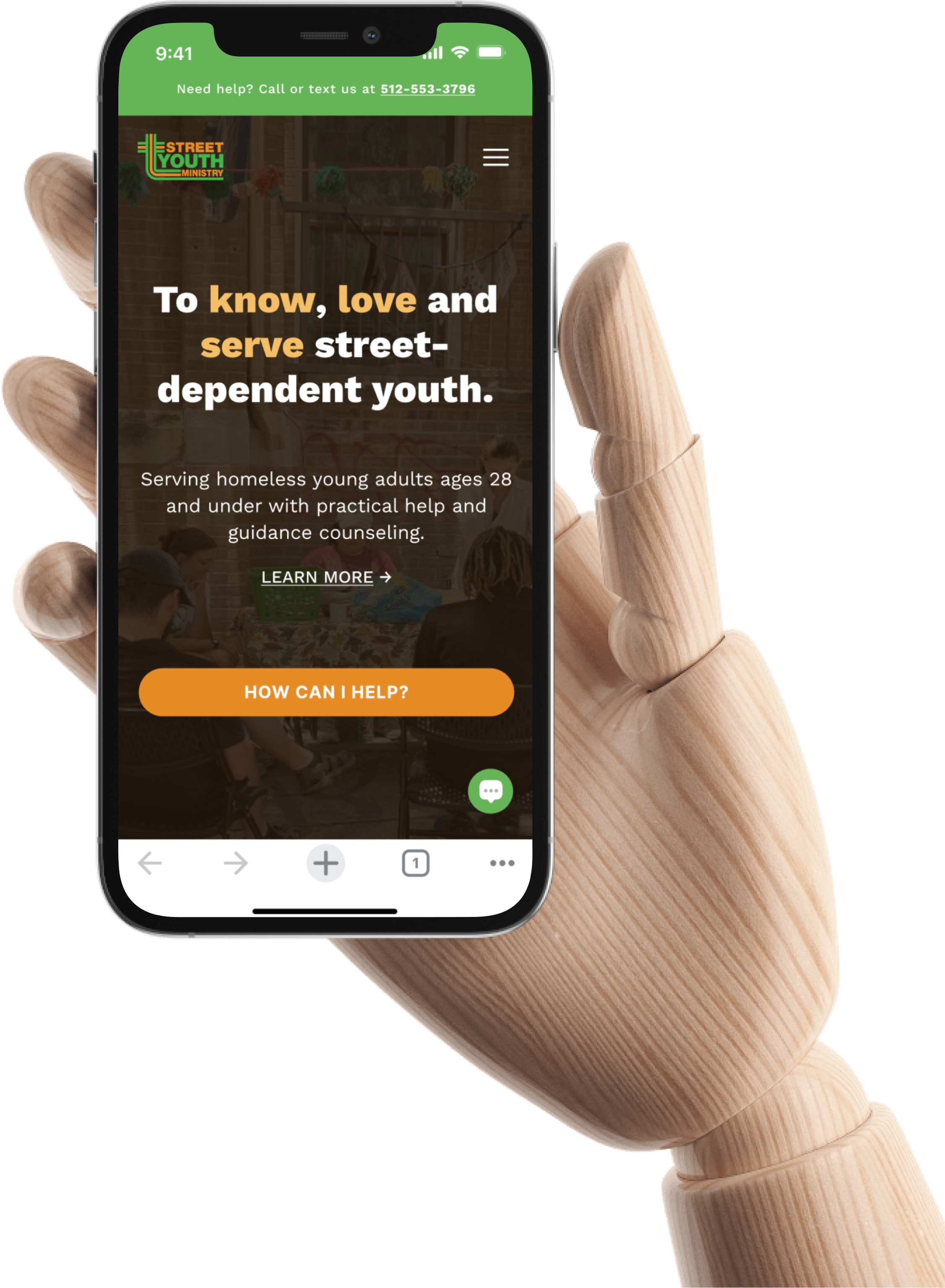
The second phase of redesign delivers an enhanced Homepage that helps people easily discover ways to get engaged.


Poor content organization impedes
Clients, Donors and Volunteers from identifying information relevant to them.
Phase 1 of redesign identified 3 key areas that cause disorientation:
Hierarchy, Text Volume, and Styling.
Volunteers wanting to get involved feel that finding the right info is confusing, and that the site is cluttered and unhelpful.
“People just want to know where to go right off the bat.”
“Learning where everything is makes me and my coworkers want to cry.”

Donors who want to understand SYMIN’s work think excessive text buries critical info.
“Our peer counseling aspect.. it’s probably lost somewhere on the site. Even staff have a hard time finding it.”

95% of testers who explored the site felt that color and type choices were harsh, inconsistent and distracting.
“There’s so much green.”
“There’s so many buttons with long, confusing labels.”
“Is the site finally being made color-blind friendly?”

Goals of the redesign focus on improving usability and increasing engagement rates for the 3 primary users.
Reduce # of customer service requests
Increase # of Client, Donor and Volunteer registrations
• Donations to meet 2022 goals fell short by a staggering 73%.
• The number of Volunteers decreased by 81% from 2015 to 2021.
Increase click-through rate of client app (SYMinU)
Increase # of Newsletter subscribers
Subscriber count has steadily increased since 2012 until 2022.


Outline the ideal journey for Clients, Donors and Volunteers in their efforts to get involved.
Each unique flow reveals the users’ thoughts and feelings while working towards their respective goals.
.png)
How might we support users in quickly finding the information they’re looking for?
Align with the needs, emotions and expectations of Clients, Donors and Volunteers.

Help people find information by themselves.

Encourage volunteers and donors to get involved.

Bring in more street youth clients.


Re-imagine the Homepage as a central space where people can easily access help, sign-up to volunteer, and make donations.

Help people find information by themselves.
Differentiate what content is for which audience(s).
Use shortcuts to help different users begin their tasks.
.png)
Explore patterns and layouts that support Clients, Donors and Volunteers in their distinct experiences.
Reference flowcharts and incorporate the new navigation menu to help determine a suitable page structure that satisfies the goals.
VIEW WIREFRAMES


An upgraded Homepage that helps
Clients, Donors and Volunteers
easily find information to get involved with SYMIN.


.png)


.png)
Use colors and typography that are pleasing, legible and scannable.
Many clients have a hard time with reading and comprehension.
Selections should be accessible and inclusive of all audiences - especially for visually impaired persons.

Link the new Homepage and existing site pages to simulate a working prototype to test.
Confirm that the design helps achieve set goals and solves the current problem.


Adapt the design for desktop to ensure that users can find what they need on different devices.


Measure success through reduced site inquiries, improved engagement rates, and higher registration numbers.
Reduce # of customer service requests
77% average success rate of all tested tasks.
• “Even without the navigation, you can easily find everything you need on the Homepage. It’s easily understandable.”
Increase # of Client, Donor and Volunteer registrations
71% success rate in finding involvement options.
86% success rate in finding assistance via the banner or chat.
• "I like how the first CTA is 'how can I help' for those who want to help.”
• “It’s nice to go in-depth on their mission and programs.”
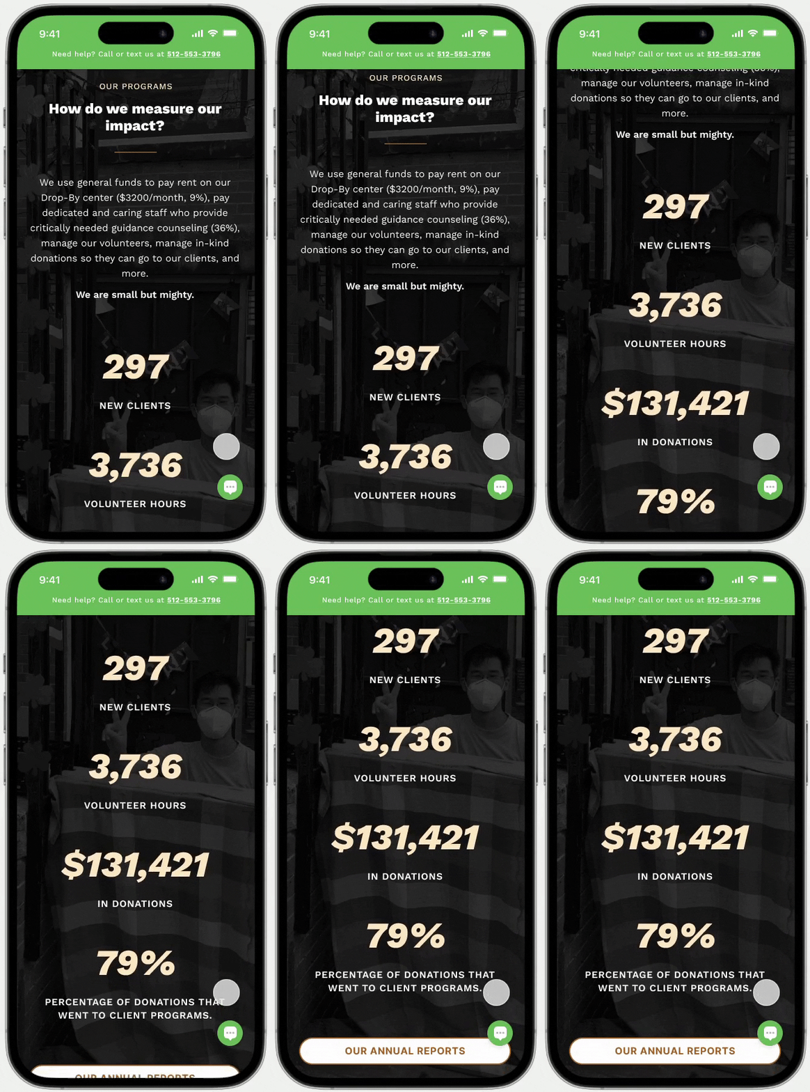
• “I feel welcomed because there’s proof that real people have been serviced.”
Increase click-through rate of client app (SYMinU)
93% success rate in opening the SYMinU app.
• Dedicate a section to its advertisement
• Using touch points throughout (QR codes, links, CTAs) for easy access
Increase # of Newsletter subscribers
• “It’s intuitive and easy to navigate. Options are concise and uncomplicated.”

The new Homepage design heightens the journeys of Clients, Donors and Volunteers in their efforts to get involved.
Improve their experiences by improving content organization, scannability and program engagement visibility.

An inspiring online presence gathers support for SYMIN to continue pursuing their mission :
“ to know, love and serve street youth. ”

.png)
UX is the foundation of working solutions.
While the end product may be the only visible result, its usefulness heavily depends on usability testing and user research that determines final design choices.
Establish a healthy relationship between designers and project stakeholders.
When there’s clear alignment between stakeholders and designers about expectations and timelines, the project becomes more collaborative, enjoyable, and productive. Communication and teamwork among all parties is crucial for achieving success.
Business goals are tied to user goals.
Solutions that satisfy customers is closely linked to a business’s success. Acquiring and retaining users is directly related to delivering enjoyable and beneficial solutions that meet their needs.
Numbers don’t always reflect behaviors.
User behaviors may demonstrate anomalies that skew results. This is why it’s important to collaborate on research and writing tests.
Examples:
• High misclicks rates = Just exploring the design
• Long completion times = Left test idle before returning


